Thursday, January 29, 2009

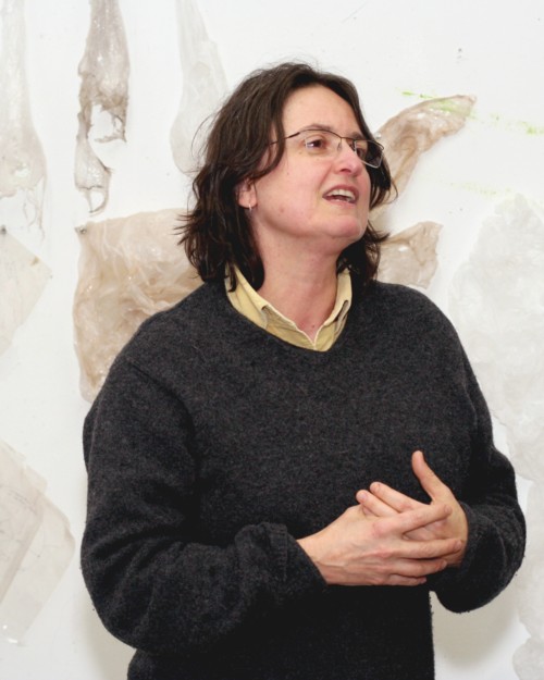
Koan for Kini Collins

Kini Collins paints pretty unicorns. They canter over emerald fields, pink manes in the wind, hooves striking silver sparks from the stones.

In fact, she doesn’t. But if she did, if they started showing up in her work, she hopes they'd be welcome. "If I see something I'm doing that disturbs me, that I didn't know was in me," Kini says, "I want to keep doing it. If I start painting pink unicorns, I hope I'll continue, even if it grosses me out."

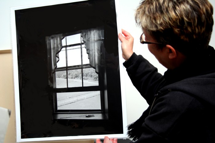
Last year, Kini decided she'd spent enough energy trying to promote and sell her work—her paintings and sculpture. She stopped submitting to shows, pulled her work from the galleries that represented her, and quit attempting to make a living from art. Now, she only sells her art directly out of her studio, and she sells it for the aggregate cost of her materials, calculating the total amount it takes to make her work and then dividing that by the number of pieces she has. Last time she invited buyers to her studio, she sold her paintings for 35 dollars each.

Though she isn't sure this has had an effect on what she paints, she feels the liberation of her decision. "I don't feel like I have to repeat myself to satisfy a gallery or the market. I know that whatever I'm making, I'm being true to myself."

The challenge for any artist is to keep on compass, to find the still point of their creative life and make sure that, among the business of art, the art stays central. For Kini, this challenge is paramount, and one she keeps mindful at all times. The moral content of her work is, as she says, as important as the aesthetic. In fact, they're much the same thing.

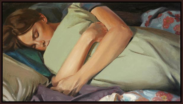
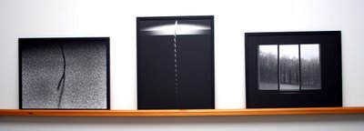
Kini's paintings are spare, economical. The colors tend to be muted and the forms simplified. There is a solitude about them and a strong contemplative bent. She's fond of birds, pigeons and sparrows and the red knot, which gathers each spring on a beach in Delaware. It's interesting that these birds—usually considered such social animals—are often alone, a single pigeon against planes of thickly applied color or the hazy form of a red knot in flight. The last is particularly striking, given that the red knot is known for its crowded seaside arrival.

Also interesting is the stillness that envelops the birds. Kini sculpts pigeons and sparrows out of wire mesh and plaster, perching them on rough blocks of wood. The nervous energy usually associated with birds is quieted, and there is a turned-inward quality, the wings and eyes calm and restful.

"What I like to do," Kini says, "is find the essence of something and see if it fits inside my integrity sphere, whether it resonates with me emotionally, morally, and physically." This search for the essence of things takes Kini within herself, to look for the center spot, the quintessence of a bird or a patch of weeds, and contemplate its stillness whatever movement it may typically show on the outside. The result is a kind of tension between the physicality of the subject and the meditative essence she looks for.

For many years, Kini practiced martial arts, moving for a time to Japan to immerse herself in that discipline. It's no great leap to see how the essence-seeking of her visual art stems from a similar impulse in the martial arts, with their emphasis on meditation and simplicity of form. But perhaps this is also the source of that tension mentioned above, between physicality and spirit, movement and contemplation.

The materials Kini uses in her art—thick applications of paint, wax, sand, plaster, charcoal—and her love of laboring over those materials give a strong corporality to the work. As she says, "There's always a lot more in my painting than ends up there. I put a whole bunch of stuff down and then subtract from it." The physical act of painting is thus as important to her as the final product. Interesting then that this art of subtraction, physical as it is, results in a paradoxic stillness too, a hard-won mindfulness that is very much of the mind.

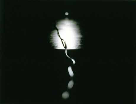
Far from troubling her though, Kini enjoys these kinds of paradoxes and seeks them out. On the one hand, she speaks of the inward quality of her art, how her birds and cityscapes are always some reflection of her thoughts. Later, she tells me that her spine series, elongated depictions of backbones in paint and wax, are the only truly personal work she has done, reflecting her struggles with disc degeneration. The apparent contradictions here do not seem to bother her, probably because both are true in their own context. For Kini, the tension between two seemingly opposing ideas makes for a greater truth, one more complex and hard won. "The next incarnation of humans," she says, "if there is to be one, will live comfortably with paradox."

That attraction to the hard won, the struggled for, is the same attraction she has to her subjects. Kini likes pigeons, sparrows, because they are the underdogs of the bird world, the neglected and sometimes despised, who nevertheless scratch out a good living among the streets and dirty buildings of the city. "These are working-class birds!" she says, pleased with the idea. They fit within the sphere of her integrity, the still point of her contemplation, as well as the scrappy physicality of work and the urban landscape. No pink unicorns, these city birds, though maybe one day they'll join them on verdant pastures.

Friday, November 14, 2008

Gloria Garrett: Makeup, Make Art

In art, we favor detachment, distance. An artist should be aware of the irony of her art, even when the art is not meant to be ironic. In fact, the more earnest the art, the more irony in the artist we expect. Oh, we like her to say, I'm only trying. Shouting out from the wilderness. Likely my art will never matter.

Art for Gloria Garrett matters. It has force. It changed her life and it can change others'. Three years ago, after a personal tragedy, she asked, "Lord, give me something to bring the beauty back!" She was given art.

Gloria calls herself the Mother of Makeup Art. She paints with makeup, although that word might not be the best to describe what she does. She uses the brush that comes with the eyeliner—smearing, stabbing, finessing—she draws with five shades of lipstick as if they were pastels, she selects the right shades of eyebrow pencil, and then, when she really gets going, in come the fingers and fingernails, the heels of her hands. Fifteen minutes later and she is as brightly painted as her subject, layers of color across the paper and over her hands.

"I want to paint happy!" says Gloria. "A woman told my husband that by looking at my art, she can tell I'm a happy person." There's a child-like intensity to Gloria, her laughter and exclamations, and to her work. First glance you see a funny picture of a bunny, sitting on a rock, surrounded by flowers. It has bunny ears and bunny whiskers and a bandana tied around its neck. It's a kid's drawing, you think, cute and vibrant, a precocious child. But there's a process too, a series of subtle decisions. You look again and see the working of color, the blending, the movement of paint. Pigment has been layered in to produce translucency and depth, each flower is given attention, some move with light, some dissolve into ground.

Gloria talks a lot about movement in her work. She uses Wite-Out to give an energy to her subjects, accenting the borders of her forms to impart vigor. "It lightens things up," she says, "puts the feeling and the movement in."

She's also sure of the goal of her art: to move the people who see it. Gloria is a folk artist, paints everyday subjects, scenes that help people see the joy in life. She works with the elderly and is happy to take requests for the topics of her paintings, scenes of blackboards and children for a woman who was a school teacher in her younger years. Gloria then gives much of her art away, the originals or the print photographs taken by her husband. In return, she lobbies for donations—extra canvases, a sheaf of paper, unwanted tubes of lipstick. "I'll use anything," she says. "Whatever people give me. Give me something and I'll find a way to use it!"

Gloria is what she does. That she has been painting three short years, that she wasn't trained in the university, does not stop her from identifying herself as an artist. And her confidence is meant as an invitation to others. "My grandchildren say, 'Grandma, if you can do it, we can do it.' And I say, 'Go ahead!'"

As I watch Gloria paint "A Rabbit Story," she works intently, fast, nearly furiously. She rummages through her box of makeup to find the proper colors to suit her mood. She wants to get the picture down, put the feelings in her head to paper. She lets me know, though, that she'll come back, later, spend whatever time is needed to get things right. "Patience," she says. "Three years ago, I got some patience. And patience brings you peace." Three years ago, Gloria realized there was work to do, art to be made. And she was sure of it, she made the decision: Yes, it matters.

Friday, October 03, 2008

High Art/Low Art: R.L. Tillman

R.L. Tillman is going to give you a wooden nickel. Really. He's made up a bunch of wood coins, each with a cartoony likeness of himself, one side declaring, "In Fraud We Trust," the other giving his website address. The nickel, which he hands out for self-promotion like a business card, is so much like the body of his work as to be emblematic. It's a funny idea, a bit silly, certainly stagey, it incorporates bad design—a label R.L. himself applies to his work—and plays a kind of off-hand pop-culture riff, all the while carrying a vaguely serious, vaguely political or critical, undertone. The coin is also handily metaphoric for an artist who likes to talk on two sides of the artistic conversation, populist and glitzy in much of his own work, subtle and sober in the art he curates.

In 2007, R.L. was asked to design a Radical Shack for Artscape, a booth that would stand in the food court as a kind of antithesis or antidote to the $5 lemonades and ubiquitous gyro sandwiches. R.L. came up with Cotton Salty, a booth that made cotton candy in Garlic, Old Bay, and Original Salty flavors. "Humor's an element in most of what I do," R.L. says. "People respond to humor, even people who might not otherwise be receptive to an art experience." For Cotton Salty, he designed a whole range of humorous paraphernalia, banners, logos, buttons, hats, and t-shirts, all of which featured Cotton Salty himself, an eye-patched and mustachioed cotton candy head on a stick. The whole thing was done in bright pink and black; at times, R.L. resorted to carny-type banter to attract his customers.

R.L. insists that much of his art is bad design—clumsy and lacking in proportion. When I point out that he has developed a strong and visually arresting signature style, and ask if that isn't the hallmark of good design, he shakes his head. "Talk to any real, professional designer about what I do and he or she will tell you what's up." Of course, there's pride in this self-denial. He keeps in his studio examples of bad design that inspire him, roughly drawn comics from the 40s and 50s, a beer can featuring, inexplicably, a cartoon goat bounding over a cutesy, flowery meadow.

This love of poor design is part of R.L.'s populist bent. "I want to reach past the people who go to galleries or otherwise actively seek out art experiences," he says, "to those who might just be walking around and could be surprised to encounter art." His idea to develop a whole line of promotional materials for a fictional hamburger stand, The Skull, and install it in the student union at University of Maryland, fits right in. R.L. wants to catch people off guard, charm them, make them laugh or scratch their heads, in the hope that they'll think a little more about their environment, more closely notice their habitual landscape.

What's interesting about this is that it's such a high-art concept, but it's packaged in such a pop-art wrapper. R.L. uses cartoons and fast food, bad design, over the top and show-offy installations in the hope to startle people into deeper thinking, whether about politics, social ideas, or even questions about art. "Sure," he says, "aesthetics are actually really important in my work. I have a pretty strong formal training, so I care a lot about how the work looks."

Which brings us to the other side of the R.L. coin, his work as a curator, and specifically his Minstallation Gallery, a box of 225 square inches situated under the steps at the Creative Alliance. Since February of 2008, R.L. has invited five artists or groups of artists to install themselves in the tiny space, including art by Eric Dyer, James Reeder, Post Typography, Laura Amussen, and most recently, 2008 Sondheim Prize winner Geoff Grace.

As R.L. says, he's careful about whom he invites to show at the Minstallation. "I want people who will do well with the limitations of the tiny space, but I want to ask artists for whom the limitations will be a challenge. Someone who already works in miniatures, say, might not be a good choice—it could be too easy." As such, he's asked Amussen, a sculptor who often works on a large scale, and Grace, whose installation at the BMA this summer took up two walls. What's more, the work the artists contribute is typically quite delicate, subtle, with a high degree of "concept" behind it. Amussen, whose installation Lady Chapel featured tiny gothic windows through which fragments of old paintings of women were seen, sought, as she says, to "[displace] these women, literally cutting them from their roles as mothers, lovers, friends, and wives. Now their gazes and bodies are redirected towards one another in a semi-erotic fashion."

Clearly, this curatorship is the other side of the nickel for R.L., seemingly miles from Cotton Salty or his new venture, the superheroes Captain Maryland and Boy Baltimore. And yet, one has to wonder at the origins for such an idea, this tiny art space. Is there not some showmanship, pop-art flashiness, hidden beneath its subtlety, the desire to create The World's Smallest Gallery? Certainly the art and thought going into it is serious—it's high art—but this is not curating in the usual sense, a white-walled gallery in which the curator remains mostly behind the scenes. The Minstallation—as excellently executed as it is—draws attention to its creator. It's plainly an R.L. Tillman production: quirky, surprising, "gimmicky" in the best sense.

What's also surprising is this: "What I really enjoy," says R.L., "is thinking about people seeing twhen I'm not there. Imagining someone’s reaction to this thing they stumble on. I don’t have to see that reaction, or get credit for it, to derive a sense of personal satisfaction from my work." Art for R.L., as playful, funny, and interactive as it is, is most enjoyed in his imagination, in the incubator of ideas. Or maybe it's not surprising at all, not for an artist always onto something new, the stacks of notebooks in his studio overflowing with ideas. High or low, the artist is in his art.

Sunday, May 18, 2008

I Dwell, You Dwell: Megan Lavelle, Magnolia Laurie

Megan Lavelle is asking friends, acquaintances, near strangers to live in her home. She isn't asking them as guests—these painters, sculptors, thinkers—but as residents, people who will live in her Charles Village studio for the weekend while she's away at her mother's. These residents will sleep in her bed, handle her most personal objects, rearrange the furniture, and, through art and contemplation, transform her apartment into something new, and possibly strange. At the heart of the matter, Megan wants to know, How do we live, how do we dwell? How do you? How does she?

We live our lives in patterns, arranging them amidst the objects and movements we make in our houses. "I was thinking about how my life compares with my mother's," Megan says, "How completely opposite we are. She's so neat, the kind to vacuum right out the door. And I was wondering, how do we develop these habits, where do they come from?"

At the center of How We Dwell, the name of Megan's 3-month-long project, is conversation, the inward conversation Megan has with her mother, about their different lives, and the conversations the artists who take up occupancy in her studio have with her. The first of these artists, painter and sculptor Magnolia Laurie, spent a weekend at Megan's, reading the philosopher Heidegger, writing on an old portable typewriter, handling Megan's things, and building sculptures from colored drinking straws. "What is the creative process of living alone?" Magnolia wants to know. "That mindless sort of action, I thought it would be interesting to observe." In her attempt to make those actions explicit, Magnolia began rearranging the collections of things Megan has put together over the years, creating an object "shrine" of sorts—photographs, knickknacks, mementos. Megan's life, as mapped by these things, was reordered, enhanced, through the screen of Magnolia's perceptions.

How do you make a life? Magnolia wonders, and through her objects, her home, Megan responds. One wonders though, in such an intimate setting, such a close dialogue as was had between the two artists, what is the nature of this conversation? What are its dynamics, its questions of power and exchange?
As part of her residency, Magnolia also sculpted. Her arrangements of drinking straws linked end to end formed webs in the corners of Megan's apartment, connected walls and ceilings in airy spans, grew up and around the computer table, through the tangles of electrical cords, like growing ivy. "The straws," says Magnolia, "were a physical representation of the process of my thinking about being in Megan's space that, unlike my rearrangements of her personal objects, which only she would probably notice, would be visible to others."

Building the straw sculptures became, for Magnolia, a track of her ideas, an asking of the questions, how do we build a life, how does my life and Megan's connect? In most of these arrangements we see a clear give and take, the sculptural vines meshed harmoniously with the other woman's living space, complementing and magnifying it. In some though, and one in particular—a net of straws spreading out over a chair, making it unusable—we might wonder not so much how do their lives interact, but how has Magnolia's presence changed Megan's life? How has it made it over?

As Megan writes in the How We Dwell blog, "Magnolia builds a fiasco – a constructed fiasco – with Heidegger and 225 flexible straws. From the moment of entry she has sorted through my chaotic order with grace. Small, quiet, beautiful arrangements have been collected in place of clutter." Megan has accepted Magnolia's changes with magnanimity and poise. And Magnolia, for her part, was, as she says, "a polite presence," her goal not to impede Megan's life but to observe and move with it. We can wonder though, whether over the next 3 months the experiences Megan will have with her other residents will be so harmonious.

"It'll be interesting to see how these other people, some who I don't know that well, will interpret my life," Megan says. "In the time off between installations, I wonder how my habits will reassert themselves?" It's a tall order to ask oneself these questions over and again, putting yourself to the microscope of other people's investigations, giving your home over to the habits of others. In the end though, we might recognize that even the most solitary of people dwell in the homes of all of us strangers.

Saturday, May 19, 2007

Roses of Different Names: The Work of Erin Cluley

The roses in Erin Cluley's newest work are in for a fight. In Veiled Devotion 1, the five roses in this small painting stand behind a screen of repeated shapes Erin says are derived from Catholic imagery and allude to her upbringing in that religion. "The image is an adaptation of the floor plan of St. Peter's Basilica," she says, "and references things like confessional screens in the church." The flowers in this painting are effectively fenced off by the screen, held back from entering the foreground, partitioned from the viewer. The other three paintings in the series show the roses in similar states, seemingly struggling for their definition against the screen in number 2 and barely visible at all amidst the patterning in the third. The roses are strong and central images, that in number 4 even making its way to the foreground, but the resistance they face in each work is palpable.

"The roses are symbols of female sexuality," Erin says, "both a reference to female anatomy and to women's sexual lives in general." Recognizing the validity of this in Erin's work takes no great intellectual leap, considering the long history of artistic association between flowers and women's sexuality, not to mention their purely visual suggestiveness. From there, it is also no great leap to recognize that the force the flowers struggle against in the Veiled Devotion series is the oppression of religious institution, a theme that, as we'll see, runs strongly through Erin's work. What is maybe less obvious at first glance, though, is that, strangely enough, the shape that makes up the individual elements of the screen patterns is itself rose-like, the kind of rosette so commonly found in the art and architecture of the Catholic church.

Erin's piece, Veiled Confessions, makes explicit the sexual themes of her work. The central element in the piece is a figure, painted in white on a sheet of mylar drafting film, of a nude woman, her head thrown back, seemingly in some sort of ecstasy, and her knees open wide. Again, the screen pattern makes its way into the work, this time as a series of rosettes cut through the mylar, behind which are three small, metallic paintings. "The guilt in the Catholic faith is so strong" Erin says. "Masturbation, sex as a mortal sin. A lot of what I've been talking about in my work is the deprivation of my sexuality as a woman." Again, then, we see the rigid religious patterning juxtaposed with the sexual, the guilt and repression of the one against the open and unabashed freedom of the other.

What is interesting though is how this pairing is treated in her work, how other types of pairings work as well. Erin's grandmother was Lebanese-American, and this Arabic lineage was central to many of her early works, especially her Heritage series of paintings. Later, after a trip to southern Spain where she visited the Moorish palaces and mosques, Erin began incorporating Muslim-related imagery into her work, often right beside the Catholic. Her painting, Ten Lovely Prayers, combines a floral pattern at one side of the painting and a series of nails at the other, all over a cloudy, mediative wash of color. "When I was in Spain," says Erin, "I was taken by how they used pattern and repetition on the walls that gave this quiet, meditative feel. And I realized that they used the same [rosette] pattern I was using in my earlier paintings in reference to Catholicism."

The nails, then, with their Christ-like connotations, their nod towards penance and punishment, their undertones of sexual penetration, are balanced against the quiet, mosque-like atmosphere of the painting, the echo of Muslim devotion and prayer in the floral designs. As Erin says, "Something came together for me when I visited Spain. I found a way to bring a light into the work I was doing, dispel some of the anger I had against my Catholic upbringing." Erin had found a bridge between Catholicism, its rules and punishment-reward dynamic, and the spirituality she felt among the Moorish architecture, a bridge made up, appropriately for an artist, of images.


Even in her latest work, those small paintings of roses, works that apparently pit religion against freedom, we see a similar balancing, a careful weighing of elements that points almost to a need for reconciliation. We see this in the compositional harmony of the work, a structural equilibrium between those rigid patterns and the organic shapes of the flowers. As Erin says, "I know my work is heading in the right direction when I find a sense of composition, the harder elements working alongside the softer ones. I absolutely need that," she adds. What's more, the opposing kinds of imagery, veils and flowers, the meditative and the rule-bound, are dependent upon each other in the work for their potency, the ecstasy of the figure in white requiring the boundaries of religion to emphasize and define itself.

Seen in this context, Erin's work may be less about struggle, hard versus soft, rule versus freedom, than it is about integration. There is almost a theological outlook to her work in its need for balance in opposition. The roses that in her paintings have come to represent her striving toward sexual and intellectual expression are balanced against the patterned roses of the church, finding echo and resonance, compositional unity, only when arranged together on the same canvas. Certainly this does not downplay the importance of that struggle, overcoming the should-nots of personal and cultural history, but Erin's work reminds us of the essential duality of our religious, and Western, thinking and of finding our way to some reconciliation of light and dark, freedom and constraint, action and meditation.

Wednesday, April 18, 2007

The Violent Collage: Work of Ramsay Antonio-Barnes

Ramsay Antonio-Barnes is throwing knives at you. His large wall collage, Tool, is a spray of knives, a jet of blades erupting from a central core, menacing the room. The work is personal, reflecting Ramsay's boyhood fascination with knives, his long-time membership in the Boy and Eagle Scouts, but there's a stark objectivity to it as well, an almost ritualized show of violence, and fear, directed at, and implicating, the audience. "What is our capability for violence?" Ramsay asks. "Do knives kill people or do we kill people? How much do we fear that capability?"

**

Several years ago, Ramsay began appropriating images from camping and Eagle Scout manuals to use in his painting. He used these images of Scouts and Scout leaders to look at adolescence, its fears and hopes, its burgeoning sexuality, and to explore how in contemporary culture we make the transitions to adulthood. "The work deals with the kind of sexual ambiguity of the time," Ramsay says, "that awkward coming of age and realization of sexual identity." His painting, Infolding, shows boys in various poses, squatting before a race or wrestling together on the ground. The depictions might seem straightforward enough except for the bloody-colored smear wiped across a boy's face or the sexual tension Ramsey imparts to the piece through the boys' exuberant physicality and evocative poses.

Again, there is the obvious personal aspect of these paintings, Ramsay reflecting on his childhood, his coming to terms as a bisexual male. And yet the illustrative quality of the images, borrowing as they are from manuals, allows a certain remove from the work, an emotional distance through the generalized quality of the drawings. Through the paintings we're invited to look at the ritual of childhood and sex, its violence and fear and excitement, stand back and observe how we, and we all, cross that threshold from children to adults.

For Ramsay, the knife image is a perfect distillation of this subjective/objective interplay. "The knife," he says, "has become almost an icon for me because it's both something personal, but it's also a compact symbol for bigger ideas of violence or control." In his pocket-knife collages, Ramsay has photographed his Eagle Scout knife and then Photoshopped in images of Edwardian era Coney Island divers, mustached and dressed in full-body bathing suits. These divers, which Ramsay describes as feminized males with their pointed feet and graceful diving poses, are balanced against or in opposition to the knife handle or blades. Looking at these collages, we can wonder, are the divers using the knives as gymnastic props or are they doing their best to avoid the sharp edges of the blades? "Who is in control?" Ramsay asks.

In a similar vein, Ramsay has been looking at images of bullfighters, stylized and androgynous, and incorporating them into mixed media works of cut paper and sequins. "In bullfights, you have this very ornate man," he says, "and this display of ritualized murder, but there is also a strong element of danger, things that can be controlled and things that can't." Ramsay has an interest in going to watch the bullfights, just as he attended a night of boxing matches not too long ago, out of a desire for personal involvement: "I wanted to go to the boxing matches to pay, to promote this thing, to be as much a part of it as I could while still being a spectator." Still, again, there is the tension in this work between a sense of individual experience and a stylized remove. His drunk love sculpture, a recreation of his personal punching bag screen printed and hand stamped with the images of men in a boxing ring, has obvious autobiographical elements but something in its size and weightiness is also distant and objective, clearly a constructed object of art.

**
"The knife is a perfect open/closed, on/off form," Ramsay says. "When open, the knife has a whole different meaning, whole different connotation, than when it's closed. What happens when you open it?" For Ramsay, the appropriation of this image, like the images of bullfighters or Eagle Scouts, generates a powerful crux between opposing forces, ritual versus action, male versus female, personal versus universal, subjective versus objective. His work, constantly collaging itself, borrowing from his life and others', from camping manuals and diving illustration, grapples with our shifting sense of identity, who we are and how much we, and how much the world, are in charge of where we are going.

Thursday, March 15, 2007

Laura Shults and the Sculpted Sky

Laura Shults dislikes being asked why, why she builds airplanes, out of wood and plastic and lead, why she is fascinated with clouds, sculpted from foam and paper, why she is so taken with flight and air and sky. She dislikes the question because it's hard to answer, she dislikes it because she's not sure she knows, she dislikes it because she's not sure she, or we, need to know. "Why do artists do anything?" she asks, her smile challenging but friendly.

For Laura, art is process. In her Area 405 studio on Oliver Street, she is at work sculpting a new airplane. The building was a curtain and blind factory and when the company moved out, it left behind rolls of fabric and plastic—green vinyl and red checks. After Laura has designed the skeleton of her airplane, drawing out the plans on broad sheets of brown paper, and then has fashioned it together, she will cover the craft in a gold polyvinyl found in a room upstairs, padding and shaping out the plane with a layer of foam. This discovery of the gold material plays into Laura's love of experimentation, the serendipity of the find and the working out of how to use it. "Making the planes becomes art" she says, "as I look into the construction and form and how to use the materials to get there." With her drawings and sketches on the walls, models made from pipe cleaners and foam, this process of trial and error is in evidence everywhere in the studio.

A sense of humor, too, is necessary for Laura, who thinks of her sculpture, the clouds and planes, as toy-like, even a bit silly. "They are actually kind of ridiculous objects," she says, of the planes. "They are about flight but they will never fly. They can't fly." This tension between function and form goes back to her college days as a furniture maker. Then, she was intrigued with the sculptural possibilities of chairs and tables, playing with biomorphic shapes and colorful pattern, but the necessity of standard measures, of providing sufficient leg room or platform height, didn't much interest her. "I wasn't into being a craftsperson. I wanted to be imaginative and make sculpture that came alive but that was also a chair."


The clouds Laura makes, armatures of reed covered in tracing paper or, more recently, foam carved with an electric steak knife, seem an ideal subject on which to let her imagination fix. Again, the process of finding the right material, manufactured reed or natural willow, furniture maker's foam or closed-cell plastic, and then of how to use it is central. But we can speculate perhaps that this approach, one that relies on process more than conceptualization—"I work mostly subconsciously," she says, "start working and figure out why later"—is particularly suited to the subject of clouds. In the course of trial and error, of working out her ideas through material experimentation, is the construction of these ephemeral, almost otherworldly, and always-shifting objects emblematic of the imaginative process itself?


This may strike some as over-analysis—and fairly enough. What's clear though is that her airplanes, her clouds, the blue of the skies she sets them against, have strong associations with childhood play and imagination. She loves the retro look of old airplanes, their sometimes clunky, sometimes sleek, space-age design, an affinity for old things she developed partly by rummaging through her grandmother's attic as a girl, dressing up in the old clothing and jewelry she found. And the simplified fuselages and wings of her own planes do suggest a kid's idea of aircraft and flight, the wonder that those funny hunks of metal can fly at all. What's more, the wall of her bedroom as a girl was painted in clouds, clouds she now reproduces with the help of an old photograph for the walls of other kids' rooms.

The impulse behind her sculpture, then, is clarified, at least a bit, though the significance remains dusky. "Why do artists do anything?" Laura asks, and with some just cause. Were she to sculpt the figure—something she's never been interested in—would she be asked so often, as she is about her airplanes, Why, why people? "I don't like to think too much about it," Laura says. "You can end up stuck that way. There's a feeling I get when sculpting that lets me know it's working." She goes about her business, experimenting with wings, leafing through field guides to clouds, thinking about future projects with zeppelins and airships, and letting form, material, and fascination lead the way.

Friday, February 16, 2007

Sex and Mystery: Paintings of Zachary Thornton

Zachary Thornton wants to dispel the notion of himself as a photo-realist. "Technically, my work is representational but in no way photo-real," he says, of his painting. "I want the people and the surroundings to seem real, to have that weight and believability, but also to maintain the vigor and excitement of the act of painting. The goal isn't to copy a photo, make a photo large." Given the exquisite attention to detail in his work, most of which shows past or current girlfriends in various solitary attitudes, and the care taken to define precisely the shape of a lip or the drape of a hand, the impulse to regard his work as photographic in quality is strong. The women he paints are so clearly individuals, so obviously expertly rendered by this painter who has worked as a commissioned portrait artist, that the label photo-realist, perhaps even hyper-realist, seems at first perfectly apt.

That Zach paints from photos rather than live models, preferring to work in solitude at his Mill Centre studio, might only reinforce this idea. Except, we learn that many of his compositions arise from combinations of photographs, one perhaps of a girlfriend, the other maybe taken years earlier, a photo of a house, which he then melds together on the canvas. He will also stage the photos he needs, positioning his subject under a streetlight on a summer night, say, which he then will bring back to the easel. "I'm looking for a kind of complexity," Zach says of this process, "a mix of feelings--happy, sinister--and a kind of mysteriousness. I like having three or four possibilities of what might be going on in the painting."

It's not then the bare facts, the subject and her surroundings, that Zach is after, but a mood, a feeling, a story that envelops the painting. A major inspiration for Zach is film. "Whenever I watch a movie," he says, "I'm thinking about composition, framing, what's going on around the characters." This interest in movies is reflected in the fact that many of his paintings are done in film aspect ratio, the 16 by 9 format of a movie screen. The effect this has is to open the painting up, provide space around his subjects, the twilight of a suburban neighborhood, the lights of an approaching car. This space, the landscape rendered in light and shadow, a feeling of things happening just "off stage," contributes tension to the work, mystery. "I have the feeling that someone else is there beyond the edge of the painting, maybe it's me, or you, the viewer," he says. "And I like to think of these women as slightly dangerous."

In his efforts to create this tension, Zach finds himself wrestling with the idea of control, a desire to render his subjects in fine detail, but with a competing impulse for looseness as well. One of his favorite painters is John Singer Sargent and the influence is obvious, the still moment surrounded by light and expectancy, the attention to the eyes and posture, the detail, the revelation of personality. "People are what it's all about," he says. "The subject has to be there for it to mean something to me." And in looking at his work we feel this investment in character, the drawing out of emotion and thought in the women's bodies and faces. Yet, though not as striking or immediately apparent to the eye is the time he has taken with the hazy forms of buildings and trees, the half-fading, half-emerging atmosphere at the wings of the canvas, that just-dark mystery Zach says he remembers so vividly from childhood.

And it's interesting that this tension between realism and ambivalence, control and lack, is reflected in Zach's process as well as his products. As a painter, he feels the need to improve with every work, for each new canvas to be a bit better than the last. Yet, as he says, at some point he invariably goes wrong. "I get to the place where the painting is going okay, but then I get tight, and I mess up." This, he says, is part of the method. "I have to break the painting along the way so that I can come back to it later, fix it, and make it better." This moment of breaking, this loss of command, brings vitality, a fresh vision to the canvas. From there, he sets to work again, building character, story, complexity, sex and mystery.

Friday, January 12, 2007

Land and Borderland: Photography of Lynn Silverman

It's hard to pin Lynn Silverman down. If you ask about her photography, its origins, its meanings, its intentions, her answer will be thoughtful and cogent, but it will be full of arrows, first pointing one direction and then another. She resists being interpreted, as do her photographs, the sinuous or stretched cords of lights and lamps, nearly but not quite abstract; the photos of windows that show hints of interior, suggestions of exterior, reflections and shadows; the fantasy tabletops of electronics and forests. Her pictures explore the edges of things, both literally, table edges and window frames, and metaphorically, the boundaries of consciousness and darkness, known quantities and the wild. Her work, as she says, is like that of a surveyor, charting out borderlines and frontiers.

In her Lifelines series of photographs, Lynn sets up tableaus of light and shadow, pictures of electrical cords, illuminated by the lamps they power, often draped or stretched over table tops. As she says, these photos are "a way of working with light in a plastic way, actually throwing light and casting shadows, as if it were clay." She enjoys the process, "profoundly physical," of finding the personality of the electrical cords, playing with their tension, positioning their plug ends or frayed wiring at different spots in relationship to the table edge.

For Lynn, this act of representing the cords and the light that illuminates them, drawing out the physical qualities of light, is of primary importance. "I'm working with what I see," she says, "what catches my eye." And yet, in looking at the photographs, one can't miss the metaphorical tensions involved. These are worlds of self-reflexive consciousness: power revealing itself, photography (i.e., writing with light) speaking of itself. Simultaneously, as Lynn points out, there are those regions of the photos that are outside our eye, the darkness below the table edges, for one, into which many of the cords descend. The table tops act as boundaries, light from dark, knowing from unknowing, just as the photos themselves ride the edge between representation and abstraction. In speaking with Lynn, she is careful not to "over-determine" your reaction to the photos either way, content with letting you ride the borderlines.

The photographs from her Lookout series—interior shots of windows and the things beyond them—work with similar frontiers. Much of the delight in photography for Lynn lies, she says, in "the pleasure of framing," selecting out of the world those regions that will lie within the photo, and the pictures of the windows only double that enjoyment, frames within frames. In these, we are given a window looking out at a scene, of grass, of buildings, of trees. At the same time, we are allowed a hint of interior space, whether of curtains or blinds, a bit of wall and furniture, the ornate aerial of a TV. Thirdly, and perhaps most importantly, we are given the window itself and the way it reflects, refracts, and distorts, separates and joins the two worlds it borders.

In her biography found on her Maryland Institute College of Art homepage (she is an instructor at the college), Lynn writes, "The act of photographing is discovering a series of relationships between you and the world," and "like a surveyor, photographing is an orienting activity." The windows in Lookout thus act as a kind of psychic map, exploring our relationship and our position with the world, internally and externally, giving us a fix on our relative location on the earth. And yet, it's interesting that Lynn works hard to remove identifying signs from the landscapes she shoots through the windows. The grass we see through one window, for example, could be that of a suburban backyard in Maryland or perhaps at the edge of the Australian outback. "Most of the photographs employ a minimal amount of detail to evoke a sense of place, which may make the identification of place ambiguous," Lynn writes. "Such ambiguity plays on the perceived similarity or differences between places."

What we see here is Lynn again letting us choose, playing the line between abstract and concrete, orientation and puzzlement, so that we may bring our own thoughts to bear on the scene depicted. As she says, "the point isn't to make it difficult or into a game," but that tension of knowing and unknowing, she says, "is part of the pleasure of looking," the exploration we make with the eye. Lynn's photographs, in all their minimalism and pared-down composition, invite care and attention to detail. Much thought, feeling, and sensation lie along the boundaries, the edges of her always abutting worlds.

Tuesday, December 12, 2006

Language in Plastic: Pam Thompson's Sculpture

Pam Thompson's studio at the Fox Industries building in Hampden is full of the skins of things. She wraps objects—a coal shovel, a surfboard, a bicycle—in plastic and turns a heat gun on them, forming the plastic around them. When she removes the shovel or surfboard, what is left is not the thing itself but its description, its shape and size, its outer quality. It is as if we see hanging from the walls and leaning in the corners the word Bicycle, the word Grapefruit, the object one off, idealized in filmy plastic. Surfboard, we are told, Lawnmower, but the objects remain just distant, out of hand.

As a teacher at Goucher College, Pam is called upon to explain the meanings of art, its processes and qualities, to her students. Her relationship with language though, is complicated. As she tells me, "I struggle so much with language and writing, with finding the right adjective, and I'm never satisfied. Art is a struggle too, but there's a visual language that I get, that I accept so much more easily." For Pam, there is a language of space, of "thingness," as she calls it, and the skins of things around her studio are like the units of that language. The plastic film that makes up the outer shell of her bicycle tells her, and us, about the emptiness inside, gives us an opportunity to meditate on what's missing, a new way to think about "bike" by looking at its absence.

But if Pam is interested in the nouns of her visual language, Bike and Shovel, she is just as interested in the verbs. She tells me a story of when she was a child, helping her mother cook pudding on the stove top. "It was like magic," she says, "the way I stirred and stirred this liquid, and then all of sudden, it thickened. It was so fast." From that point, Pam was fascinated with emulsions, with chemistry, with the process of things taking shape, going from liquid to solid, or with things disintegrating, losing form. "I'm attracted to entropy, that borderland between object and not object, a perceived image but not quite."
Of course, if one is dealing with nouns and verbs, with subjects and actions, the next logical step is to put these words into combination, form them into sentences and paragraphs. In fact, this is an apt description of Pam's installation projects, works such as On Either Side of the Fold, an installation that was shown at the Villa Julie College Gallery. This piece was composed of many smaller units, "Pieta," "Tondo," "Beatrice," units formed sometimes of plastic, sometimes of "readymade" objects like tables and ladders, sometimes encompassing drawings made in, around, and even outside the formal gallery space.

"These works," Pam says, "can come together over the course of a year. Individual pieces find their way in and build up narratives." On Either Side of the Fold was, for Pam, both a reaction to a trip to Rome she made in August of 2001 and an exploration of the events of 9-11, which occurred shortly after. In doing research, Pam discovered that the radius of the famous dome of St. Peter's Basilica was the same length as that of the wing of the plane that crashed into the World Trade Center. Thus, she drew both the outline of the dome around the gallery space and a diagram of the wing on the floor. Added to this are the various other "words" that compose the piece, the column of lights that represent Dante's muse Beatrice, a ladder for the steps to the lantern around St. Peter's dome, a box of cigarette butts Pam collected once at the top. All of these elements form for Pam a visual storyline, an imagistic narrative of her thoughts, ideas and emotions of the time.

"I don't have a total plan for what I'm going to do," Pam emphasizes, "but bounce off ideas about what's going on in the world and in my life." Process, again, is critical, as is the flux of coming and going, story being built out of units of language that themselves are in flux, the plastic that makes up the words, and the meanings attached to them, changing over time. "It's entropy as an hourglass" she says, citing one of her favorite writers on the arts, the earthworks sculptor Robert Smithson. "There is black sand at one end and white at the other, and they mix together and become gray. But it gets interesting at the point where they are not too carefully mixed, but just starting." It's that moment of transition, the pudding hardening, the plastic losing definition, the story coming together and the words falling apart, that give Pam inspiration, a unique visual language with which to speak.
**
Photo of On Either Side of the Fold, Jeff Goldstein; all others, M. Cantor.